
A Brisbane-based direct-to-consumer skincare brand can usually launch its first promotion with Dawn's standard sections. The difficulty starts later. A third carousel variation, a bundled-with-shipping banner and an Australia-specific gift message may all need different content controls, but none fits neatly into the existing section library.
That's the point at which building custom blocks in Shopify becomes a maintainability decision, not a styling exercise. The right block can give merchandisers control without another developer request. The wrong one adds duplicated settings, extra scripts and a permanent maintenance obligation.
For Australian ecommerce teams, market context matters too. Shopify's architecture supports market-specific section and block adaptations, including Australia, but a reusable system still needs clear ownership, sensible schemas and disciplined release management. Shopify's market contextualisation documentation describes the platform capability, while the practical challenge is designing it without fragmenting the theme.
Table of Contents
- When Off-the-Shelf Sections Stop Being Enough
- Shopify Block Architecture and the Limits That Shape Strategy
- Building Your First Custom Block in Liquid
- Reusing Blocks, Nesting and App Blocks
- Performance, Accessibility and Device QA
- Governance, AI Generation and Common Mistakes
- When a Custom Block Is the Right Answer
When Off-the-Shelf Sections Stop Being Enough
The skincare team initially tried to stretch existing sections. A featured collection section handled the first product group, a rich-text section carried the shipping message, and a promotional banner covered the campaign headline. That approach worked until the commercial team wanted the same merchandising pattern on product pages, collection pages and a state-specific landing page.
Each workaround created a new dependency. A developer copied settings into another JSON template, added a conditional to theme.liquid, and supplied inline CSS for a layout that only one campaign used. The brand could publish the immediate promotion, but every later edit required someone to remember which copy, selector and template belonged together.
Practical rule: A custom block should remove repeated decisions from future releases, not merely make today's release possible.
Custom blocks solve a specific problem: they turn a repeated storefront component into a reusable, editor-controlled unit. Shopify describes theme blocks as reusable modules inside sections, and its documentation supports nested blocks and different ways for sections to accept them. That makes it possible to create a more granular merchandising system without rewriting the same Liquid structure repeatedly. Shopify's explanation of theme-block architecture is useful here because it frames blocks as a standard storefront mechanism rather than a collection of isolated hacks.
The warning signs
A build usually deserves investigation when:
- Theme logic is duplicated: The same conditional or markup appears in multiple sections.
- Settings drift: Merchandisers see slightly different controls for what should be the same component.
- Campaigns exceed the section library: Marketing needs combinations of copy, imagery, products or app content that existing sections can't express.
- Inline CSS keeps growing: A rushed campaign introduces selectors that later collide with unrelated templates.
- Localisation becomes manual: Australian promotions, delivery messages or compliance copy need separate edits across several templates.
A block won't fix a poor content model, a slow third-party app or an unsuitable theme. It also won't make a one-off visual concept reusable by magic. Before commissioning development, identify the repeated content pattern, the people who will edit it and the templates where it genuinely belongs.
For a broader view of how to isolate a small, testable development increment, the MVP development services approach provides a useful delivery model. The same discipline applies to a Shopify theme: prove the component, validate editor behaviour, then expand its scope.
Shopify Block Architecture and the Limits That Shape Strategy
Shopify's Online Store 2.0 model separates templates, sections and blocks. A JSON template assembles sections, while a section defines the settings and blocks that merchants can add, remove or reorder in the theme editor. Theme blocks provide reusable components that can be used across sections, and app blocks provide insertion points for installed applications.
The limits should shape the design before development begins. Shopify documents a maximum of 25 sections per template and 1,250 blocks across all sections in a template in its theme-structure guidance. Shopify's developer material also describes a limit of 300 theme blocks, while partner guidance states that a section can include up to 16 blocks. These values belong to different parts of the architecture, so teams should confirm the applicable constraint for the specific theme and implementation rather than treating them as interchangeable. Shopify's theme architecture documentation and theme structure guidance provide the governing reference.
What the limits mean operationally
A block schema should expose only the controls a merchant needs. If a banner needs a heading, supporting copy, an image, a link and a display option, adding many rarely used styling settings makes the editor harder to operate. The reusable unit becomes technically flexible but commercially confusing.
| Limit | Standard plan | Shopify Plus |
|---|---|---|
| Theme blocks | 300 theme blocks | 300 theme blocks |
| Sections in a template | 25 sections | 25 sections |
| Blocks across a template | 1,250 blocks | 1,250 blocks |
The architecture also distinguishes ownership. A theme block belongs to the theme and is controlled through its schema. An app block belongs to a theme app extension and needs a compatible JSON-template theme and section support. A section or theme block must declare a generic @app block in its schema when it is intended to accept app content, and theme blocks can accept app blocks as children through the schema's blocks attribute. Shopify's app block UX documentation and theme block schema reference cover those conditions.
Settings such as image_picker, product and link_list are attached to the block or section where they're declared. They don't automatically become global values across every instance. That distinction matters for Australian storefronts using different messages by market. Put market-sensitive content in the appropriate block or data source, and avoid assuming that a setting edited in one section propagates elsewhere.
Building Your First Custom Block in Liquid
The smallest useful implementation starts with a clear contract between the section and the block. The section declares which block types it accepts, while the block's Liquid file renders the markup and reads its own settings. Shopify's 2024 developer preview introduced the block.liquid pattern, with the file placed in the theme's /blocks folder, and supports nesting up to 8 levels deep. Shopify's block architecture reference documents that model.
A practical naming convention prevents confusion six months later. Use kebab-case for the block type, name the file after the type, and keep the rendered component's purpose obvious. For example, banner-with-icon is more durable than promo-variant-3, because the former describes a reusable interface while the latter describes a campaign moment.
A compact implementation pattern
Inside a section schema, declare the block type and its settings:
{% schema %}
{
  "name": "Campaign content",
  "blocks": [
    {
      "type": "banner-with-icon",
      "name": "Banner with icon",
      "settings": [
        {
          "type": "image_picker",
          "id": "icon",
          "label": "Icon"
        },
        {
          "type": "text",
          "id": "heading",
          "label": "Heading"
        },
        {
          "type": "richtext",
          "id": "text",
          "label": "Text"
        },
        {
          "type": "url",
          "id": "link",
          "label": "Link"
        }
      ]
    }
  ]
}
{% endschema %}
Render the block from the section loop:
{% for block in section.blocks %}
  {% render block %}
{% endfor %}
A blocks/banner-with-icon.liquid file can then use the block's settings and Shopify's editor attributes:
<div id="{{ block.id }}" class="banner-with-icon">
  {% if block.settings.icon != blank %}
    {{ block.settings.icon | image_url: width: 96 | image_tag: alt: block.settings.heading }}
  {% endif %}

  {% if block.settings.heading != blank %}
    <h3>{{ block.settings.heading }}</h3>
  {% endif %}

  {{ block.settings.text }}

  {% if block.settings.link != blank %}
    <a href="{{ block.settings.link }}">{{ block.settings.heading }}</a>
  {% endif %}
</div>
The exact rendering syntax can vary with the theme architecture, so test it in the Dawn fork rather than assuming a copied snippet is production-ready. For a component that must work across different rendering contexts, use an explicit snippet interface such as {% render 'banner-with-icon', block: block %} and keep the data contract documented.

What commonly goes wrong
block.settings is local to the current block instance. An image block should use image-specific settings, while a text block should not inherit assumptions from it. block.shopify_attributes also needs to be passed or rendered correctly so the theme editor can identify and manipulate the component.
Don't copy the same Liquid into multiple sections because it's quicker. Put the reusable markup in one place, define stable setting names and review the output with the block removed, duplicated and reordered. For teams extending themes or commissioning custom web development, that small discipline prevents a campaign component from becoming a private fork that only its original author understands.
Reusing Blocks, Nesting and App Blocks
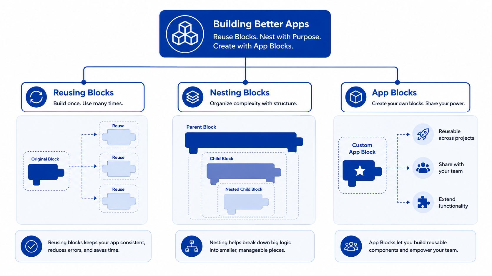
A block earns its complexity when people reuse it. The first pattern is straightforward: declare a block type in a section schema, allow multiple instances, and keep every instance's content in its own block.settings object. A product page might use one shipping message, two reassurance panels and a returns disclosure without needing separate section files.
The second pattern is shared rendering. If a component needs to appear in more than one section, keep the visual markup in a snippet and pass the block explicitly:
{% render 'banner-with-icon', block: block %}
That makes the dependency visible. It also gives developers one place to fix markup, classes or accessibility behaviour. include is older and less isolated, so render is generally the safer choice for new work.
Nested content needs boundaries
A parent block can accept child blocks by declaring the relevant relationship in its schema. This supports patterns such as a comparison panel containing individual comparison rows, or a promotional group containing a heading, product card and delivery message. The merchant gets flexible composition without asking a developer to create another section for every variation.
Nesting can also create editor overload. Shopify's documented nesting depth of 8 levels is a technical ceiling, not a design target. In practice, keep the hierarchy shallow enough that a merchandiser can understand it from the theme editor. Give child blocks names that describe the content role, not the implementation detail.
App blocks need deliberate slots
App blocks work only with JSON-template, Online Store 2.0 themes and compatible sections. A section schema needs a generic @app block declaration, and a content area can expose app content through the block system. That's useful for review widgets, upsells and payment-related tools such as Afterpay or Zip, but the app still needs to meet Shopify's placement rules.
Shopify allows merchants to add, remove, reposition, preview and customise app blocks in the theme editor. The documented workflow is to open Online Store, launch the theme editor, select Add block under Apps, choose the installed app block and save. Shopify's app block management guidance describes that workflow.
Use kebab-case names, keep settings scoped to the component and render a block alone before connecting it to a parent. For complex stores, this is an integration boundary, not just a theme feature, so document the expected output and test the app-disabled state. A well-defined custom integrations process helps when the block must exchange information with fulfilment, loyalty or customer systems outside Shopify.
Performance, Accessibility and Device QA
Custom blocks add weight. A single banner rarely creates a visible problem, but a page assembled from duplicated images, app scripts and unnecessary JavaScript can become difficult to diagnose. I treat every block as a production component with its own markup, asset and failure behaviour.
For performance, establish a baseline before adding the component. A common target is Largest Contentful Paint below 2.5 seconds, measured on a throttled 4G connection, and Google's web performance guidance defines that threshold. Use responsive image output, avoid loading a script for a purely presentational block and defer non-critical work with a suitable browser scheduling approach such as requestIdleCallback, where support and fallback behaviour have been assessed.
A practical release table
| Metric | Target | Tool |
|---|---|---|
| Largest Contentful Paint | Below 2.5 seconds | Lighthouse and Chrome DevTools |
| Cumulative Layout Shift | Below 0.1 | Lighthouse and field monitoring |
| Liquid warnings | None | Shopify theme editor and theme checks |
| Browser console errors | None | Chrome DevTools and Safari Web Inspector |
| Accessibility defects | No known critical defects | axe-core and manual NVDA testing |
These are release targets, not guarantees. Test the complete template, because a block that performs well in isolation can still interact badly with a product gallery, subscription widget or app embed.
Accessibility is part of the schema
An image block should require a meaningful alt-text decision rather than relying on a default. Interactive elements need discernible names, visible focus states and sufficient contrast against the brand palette. Test keyboard navigation and screen-reader output manually with NVDA, then use axe-core to catch common structural defects.
Device coverage should reflect actual customers instead of only the newest phones. Include iPhone 12 through 15, Samsung A-series devices and mid-range Android hardware, with Safari and Chrome coverage. Australian teams should also test the operational edge cases that affect local merchandising, such as delivery messaging, market-specific promotions and state-based disclosures.
Before release, confirm that the schema validates, the block survives removal and reordering, no Liquid warnings appear in the admin theme workflow, the console is clean and the layout remains stable when apps are disabled. The production-readiness review for application code reflects the same principle. Generated or rapidly assembled code still needs observable, repeatable QA.
Governance, AI Generation and Common Mistakes
Shopify Magic can generate blocks directly in the theme editor, which makes experimentation accessible to merchants. That speed is useful for a controlled prototype, but it can create a false sense that production governance is optional. The structural limits remain, including 300 theme blocks and 1,250 blocks across a template, as documented in Shopify's theme guidance.
The recurring problem isn't that a generated block exists. It's that teams paste similar versions into several sections and then change them independently. After a few campaigns, there are multiple sources of truth for the same banner, each with different settings, selectors and accessibility behaviour.
Governance test: If a junior developer can't explain why a block exists in one sentence, the block probably needs consolidation or retirement.
Rules that survive campaign pressure
- Require reuse: Build a custom block when the pattern will be used repeatedly, or when it solves a genuine compliance or market requirement such as an Australian Consumer Law disclosure.
- Assign ownership: Record the technical owner, business owner and deprecation date with the block documentation.
- Review the diff: Theme changes should be reviewed like application changes, not published directly because a campaign deadline is close.
- Remove expired work: A campaign block that has no owner and no active use is theme debt.
- Prefer one source file: Don't allow inline duplicates across sections or themes when a snippet or theme block can carry the shared implementation.
A custom block also isn't automatically better than an existing section. If a featured collection section can meet the need with a small, well-tested setting change, extending it may cost less and create less editor friction. If the requirement is only a visual experiment with no content owner, a temporary section or controlled page build is often the more responsible choice.
The best AI-assisted workflow is review-led. Generate a draft if it saves time, then inspect Liquid escaping, schema structure, keyboard behaviour, responsive images, app-disabled rendering and the effect on the theme's existing settings. The generated code is an input to engineering, not a release process.
When a Custom Block Is the Right Answer
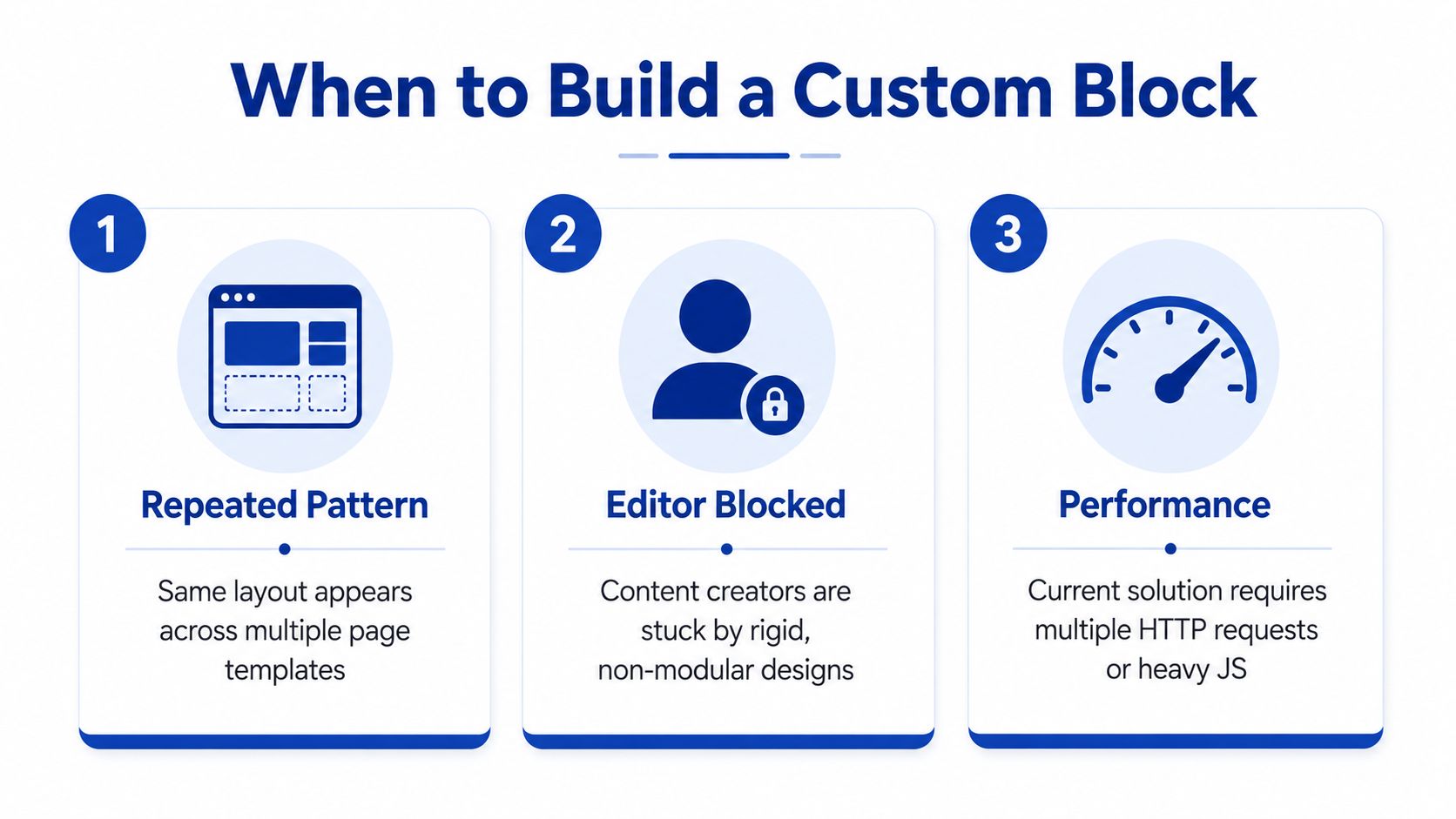
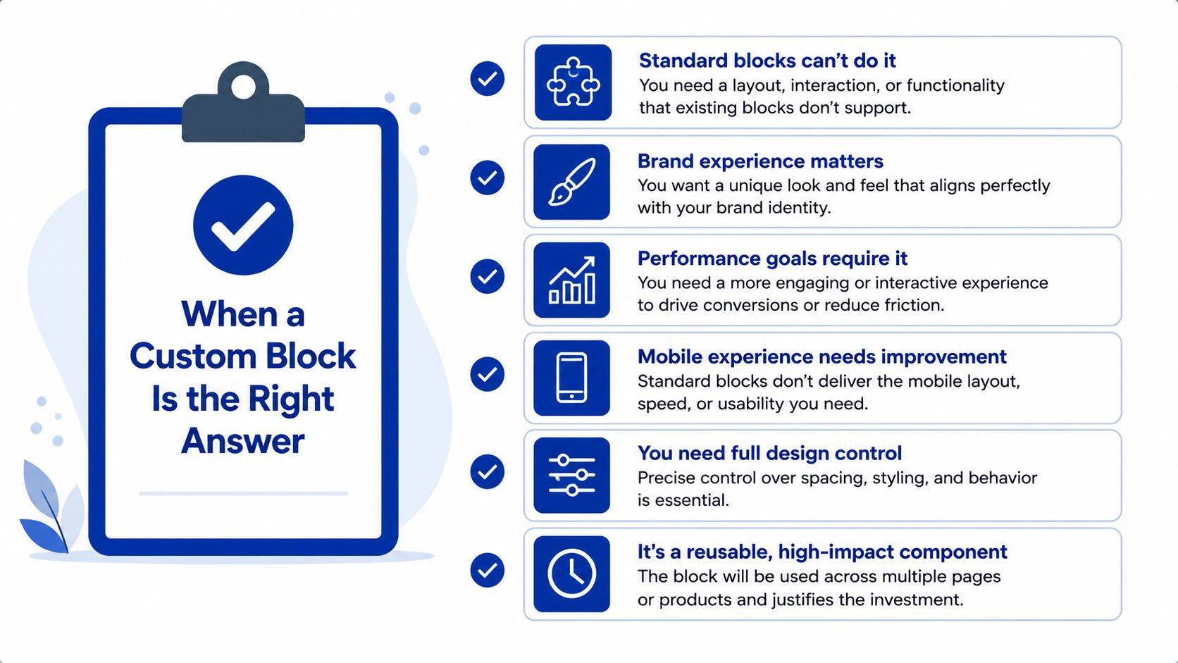
The decision is easiest when the team describes the operational problem before describing the design. A custom block is usually justified when the same layout appears across templates, editors are blocked by rigid section controls, an app needs a supported insertion point or the Australian storefront needs market-specific merchandising that standard sections can't express.
That might include a GST-inclusive pricing message, an Australia Post delivery window or a state-specific gift condition. The block should expose the content that operations owns, while code should enforce the layout, accessibility and display rules that shouldn't change from campaign to campaign.
A short commissioning checklist
- Is the pattern repeated? If it appears only once, start with an existing section or a controlled page layout.
- Who owns the content? Name the merchandiser or operations role responsible for updates.
- What must be localised? Identify market, currency, delivery and compliance variations before schema design.
- Does an app need a slot? Confirm that the theme supports JSON templates and the relevant
@appconfiguration. - What happens after the campaign? Define an archive or deprecation path before development starts.
- Can the team test it? Include editor reordering, app-disabled rendering, device QA and accessibility checks in the delivery scope.
Avoid a custom block when it duplicates existing section functionality, represents a one-off hero design or has no accountable content owner. Also avoid forcing an app into theme code when the app block model already provides the required merchant controls. The right answer may be a theme block, an app block, an existing section extension or no new code at all.
For teams comparing theme work with a wider application build, the custom app cost guide helps frame the same question commercially: what should remain a maintainable platform capability, and what deserves a separate integration or application boundary?
The best next step is a short architecture review of the current theme. List repeated components, inspect the JSON templates, identify app insertion requirements, record Australian market variations and remove expired campaign code before adding more. That gives a developer enough context to estimate implementation effort without turning a simple merchandising need into another unowned system.
Continuum Solutions designs and maintains Shopify Plus themes, custom blocks and integrations with the governance, accessibility and device testing needed for production ecommerce. Visit Continuum Solutions to discuss a block architecture review or a phased implementation for your Australian storefront.